We help clients get a
We help clients
get a
handle on how their
customers think.

Gaining a clear understanding of your audience is critical to delivering experiences that resonate and result in action. Failing to do so risks going to market with creative that falls flat with anyone not on the marketing team.
Whether it’s setting the stage for a larger experience, evaluating the performance of in-market executions, or identifying a whole new group to go after, Experiences For Mankind employs a variety of hands-on and online methods to understand who the audience is, what they think, and how they act.
We answer questions large and small so we can pinpoint the critical insights for our clients. So our clients can make informed decisions.
Services
Qualitative & Quantitative Research, Usability Studies, Customer Ethnographies, Audience Segment Analysis, Social Listening, User Interviews

A two-pronged approach to developing a
dual-screen
strategy
With the launch of its dual-screen mobile device, Microsoft Surface wanted to bring a unique experience to their retail demo but wasn’t sure what it needed to communicate or how it should be different. We took a two-fold approach to the research.
Using social listening we gathered and analyzed real, unfiltered commentary from online discussions across multiple tech and mobile forums. This helped us answer how dual-screen devices are perceived among potential and current owners, as well as how Surface Duo is situated in the discussion.
Once we understood overall sentiment, we assessed how other dual-screen mobile devices used the format for their retail demos to tell their story, getting hands-on with them at retailer and service provider storefronts. We then used this assessment to sketch out opportunities for the Duo experience to differentiate itself in-store and effectively respond to what shoppers want to know, what experiences they want to have, as well as what perception needs to be corrected.


A two-pronged approach to developing a
dual-screen
strategy

With the launch of its dual-screen mobile device, Microsoft Surface wanted to bring a unique experience to their retail demo but wasn’t sure what it needed to communicate or how it should be different. We took a two-fold approach to the research.
Using social listening we gathered and analyzed real, unfiltered commentary from online discussions across multiple tech and mobile forums. This helped us answer how dual-screen devices are perceived among potential and current owners, as well as how Surface Duo is situated in the discussion.
Once we understood overall sentiment, we assessed how other dual-screen mobile devices used the format for their retail demos to tell their story, getting hands-on with them at retailer and service provider storefronts. We then used this assessment to sketch out opportunities for the Duo experience to differentiate itself in-store and effectively respond to what shoppers want to know, what experiences they want to have, as well as what perception needs to be corrected.
Connecting
with customers
to get a taste for what works


Something of a rebel in the casual Mexican food industry, Pink Taco had recently been acquired by a venture capital group with plans to refresh the brand and expand into new territories. This presented a prime opportunity for their new marketing team, who engaged EFM to design and develop a new online experience to coalesce with the new brand. But new ownership also meant a lot of the historical knowledge about Pink Taco and its customers was inaccessible.
Limited brand resources and rapid turnaround meant we quickly had to establish an understanding of the audience for ourselves and the client to make informed decisions. We accomplished this through a combination of on-site visits, user interviews, and rapid UX testing.
Our team set out to the Los Angeles location and spent time gathering insights and opinions from customers, servers and managers. We analyzed user flows throughout the day, learning the history of what brought customers in to dine, as well as what the most popular menu items were. This qualitative background information served as guidance for the client on what direction the story should take.
With design underway, we deployed online user testing to confirm multiple UX elements, such as navigation, information hierarchy, and overall usability throughout the process. This user feedback played a critical roll helping ensure Pink Taco’s team could launch on time with a site designed to drive reservations, while still telling a dynamic story about an uncommon chain of taco joints.

Connecting
with customers
to get a taste for what works

Something of a rebel in the casual Mexican food industry, Pink Taco had recently been acquired by a venture capital group with plans to refresh the brand and expand into new territories. This presented a prime opportunity for their new marketing team, who engaged EFM to design and develop a new online experience to coalesce with the new brand. But new ownership also meant a lot of the historical knowledge about Pink Taco and its customers was inaccessible.
Limited brand resources and rapid turnaround meant we quickly had to establish an understanding of the audience for ourselves and the client to make informed decisions. We accomplished this through a combination of on-site visits, user interviews, and rapid UX testing.
Our team set out to the Los Angeles location and spent time gathering insights and opinions from customers, servers and managers. We analyzed user flows throughout the day, learning the history of what brought customers in to dine, as well as what the most popular menu items were. This qualitative background information served as guidance for the client on what direction the story should take.
With design underway, we deployed online user testing to confirm multiple UX elements, such as navigation, information hierarchy, and overall usability throughout the process. This user feedback played a critical roll helping ensure Pink Taco’s team could launch on time with a site designed to drive reservations, while still telling a dynamic story about an uncommon chain of taco joints.

Observing
behavior to go beyond
analytics
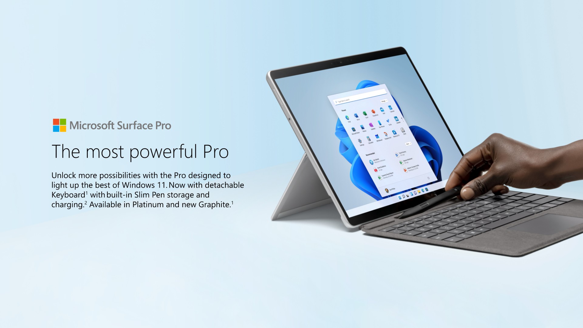
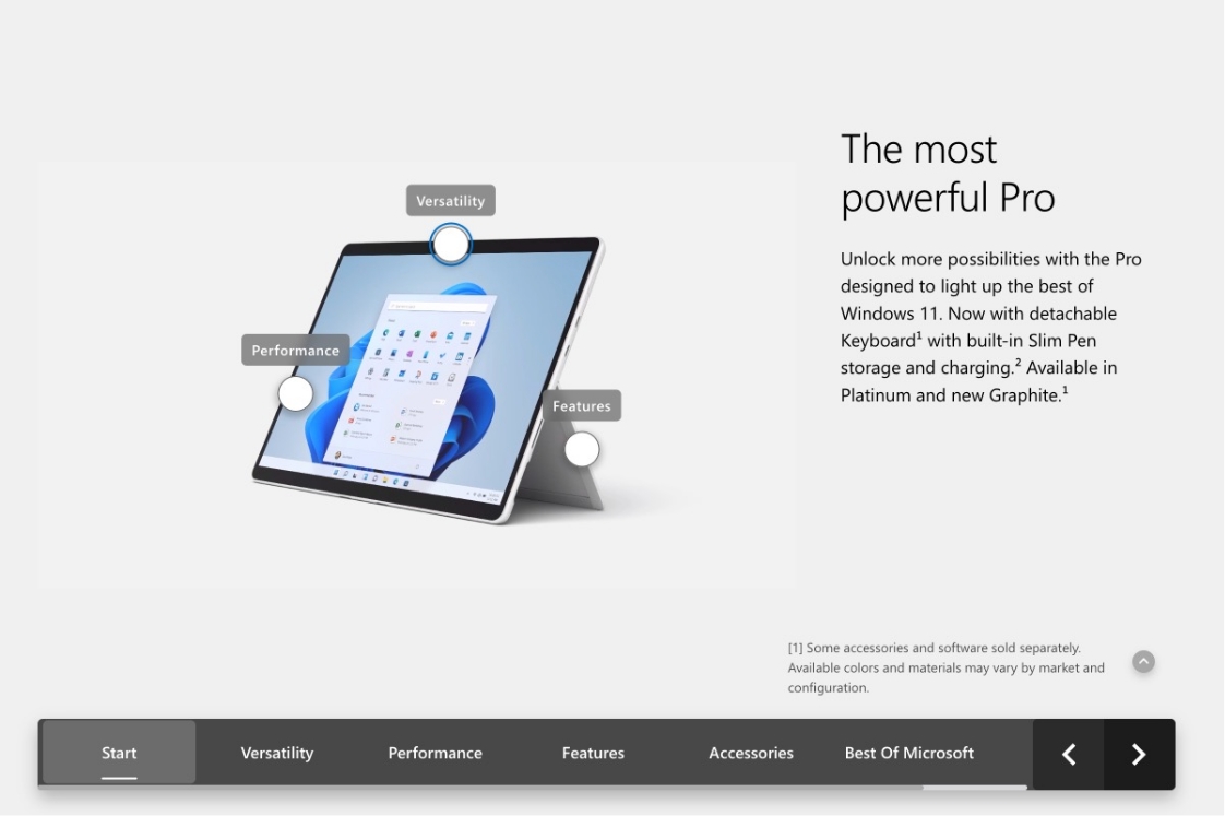
Microsoft RDX Team wanted to know if the demo experiences they were deploying throughout the year were truly meeting the needs of shoppers. While telemetry can provide a wealth of statistics about in-store interactions, a big blind spot persists around what shoppers actually think about the on-screen experience.
To gauge user sentiment, we developed and executed in-person user testing sessions with a representative sample of Surface’s key demographics. Through a mix of interviews, free exploration and task-based activities, we had users compare two designs: the current in-store version and a new simplified experience.
In all, EFM analyzed over 500 data points to give Microsoft a clear picture of how shoppers felt the experiences met their needs–what content was relevant, what about the UX was helpful, and how much it moved them closer to a purchase decision. Building on this user feedback, we developed a clear plan for improvements in the current experience, and alternative paths Microsoft might consider for future iterations.


Observing
behavior to go beyond
analytics


Microsoft RDX Team wanted to know if the demo experiences they were deploying throughout the year were truly meeting the needs of shoppers. While telemetry can provide a wealth of statistics about in-store interactions, a big blind spot persists around what shoppers actually think about the on-screen experience.
To gauge user sentiment, we developed and executed in-person user testing sessions with a representative sample of Surface’s key demographics. Through a mix of interviews, free exploration and task-based activities, we had users compare two designs: the current in-store version and a new simplified experience.
In all, EFM analyzed over 500 data points to give Microsoft a clear picture of how shoppers felt the experiences met their needs–what content was relevant, what about the UX was helpful, and how much it moved them closer to a purchase decision. Building on this user feedback, we developed a clear plan for improvements in the current experience, and alternative paths Microsoft might consider for future iterations.

